Are your product photos costing you sales? It’s time to level up your product photography editing game with jaw-dropping color correction techniques that make every detail pop!
- Use Adjustment Layers for non-destructive edits.
- Employ tools like Curves or Levels for tonal adjustments.
- Adjust Hue/Saturation for color intensity and balance.
- Utilize Color Balance to correct specific color casts.
Adobe Photoshop is a powerful photo editing software essential for achieving High-Quality images in product photography. Its editing tools allow professional photographers to refine product images and ensure accurate color reproduction. Good product photos make a big difference for your business. Bad pictures can lose you many customers. But don’t worry! Learning easy editing tricks can fix this fast.
Product photos need to look perfect to grab attention. Blurry or dull colors make people scroll away. But with simple color correction, you can turn boring pics into eye-catching ones. Even if you are not a pro, a little editing can make a huge change.
Start editing now and watch your sales grow! Don’t let bad photos ruin your hard work. Fix them today and see the difference!
What is Color Correction in Photoshop?
Stop losing sales! Learn product photography, editing, and color correction now to make your stuff look super good. You might wonder how editing pictures helps sell more things. Achieving accurate colors is paramount in product photos to build customer trust. Tools like a color checker and understanding color balance help eliminate color casts and ensure accurate color representation for potential customers.
High-quality images play a critical role in e-commerce and branding, offering a clear and professional view of products. Utilizing RAW images ensures maximum flexibility in post processing, preserving every detail for refined editing. A carefully edited single image can enhance the perception of quality and attract potential customers by highlighting unique features.
When you fix colors and make pics bright, customers like what they see more. This makes them wanna buy your stuff fast. Also, when you practice editing, you get better at showing your product in the best way. This helps you stand out from others who don’t edit well. Most importantly, nice pictures make people trust your brand and come back to buy again.
Color Grading vs Color Correction
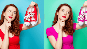
Confused about color grading and color correction? They both make photos look better, but do different things. Color correction fixes the colors to look real. Color grading makes the photo have a cool style.
Color correction restores an image’s original colors, which shooting conditions may not always capture accurately.
Lighting setups directly influence the mood and clarity of a photograph. Whether using natural light, fluorescent lights, or artificial light, understanding different lighting conditions helps photographers achieve consistent lighting and eliminate harsh shadows, making products more appealing.
When you do color correction first, you make sure the photo is not too dark or colors are not weird. Then, color grading adds mood. This helps your photos stand out and tell a story. The best way to learn is to try both and see what looks good for your pictures!
How to Do Color Correction in Photoshop?
Photoshop color correction makes your photos look nice. Even if you have never edited before, the tools in Photoshop help fix colors easily. Most people take photos that look too dark or the wrong color, so color correction fixes that.
- Use Adjustment Layers for flexibility.
- Adjust white balance for accurate colors.
- Correct tonal range with Levels/Curves.
- Fine-tune specific colors with Hue/Saturation.
No idea how to start? That’s okay! Color correction in Photoshop can be your new best friend. You can use the curves tool to make brights brighter and darks darker. The color balance fixes skin tones so people do not look green or orange. Play with sliders until the photo looks natural. Best part? Once you learn, every photo you take will look pro!
Method 1: Color Correction by Picking a Gray Color
Finding gray in your photo is the easiest way to fix colors well. When colors look wrong, gray helps make everything balanced right. Look for something in the picture that should be gray.
Click the gray point tool in Photoshop and pick that spot. This magic tool automatically fixes white balance and makes colors look real. If there is no gray in the photo, no problem! Carry small gray cards when taking pictures to use later. After picking gray, see how photos get better colors instantly. This trick makes skin look natural and removes weird color casts fast!
Step 1: Launch Image in Photoshop

First thing you gotta do is open your picture in Photoshop. Just click File, then Open, and find your photo on the computer. Click on the File option in the top menu. Then select Open to choose the file you want to edit.
If you don’t see your photo, maybe you are looking in the wrong folder. Check the Downloads or Pictures folder where photos usually go. After you find it, double click and the photo pops up in Photoshop ready to edit! Now you can start making it look better with all the cool tools. Remember to save your work lots so you don’t lose it!
Step 2: Add Gray Layer

The gray color is super important for fixing photos correctly. When colors look wrong in a picture, gray helps make everything balanced. You can find gray things in real life.
Create a new layer in the Layers panel by clicking the “+” icon. Fill this new layer with 50% gray by pressing Shift+Backspace and selecting “50% Gray” in the pop-up box, then set its blending mode to “Difference.”
In Photoshop, use the eyedropper tool to click on the gray part of the photo. This magic trick makes all colors look real again fast! If no gray in the picture, no worry, just put a small gray card when taking the photo next time. After picking gray, see how skin tones and colors get better right away. This easy way to make your photos look professional without hard work!
Step 3: Find the darkest area

Now we find the blackest black in your photo! This helps make shadows look good and not too dark. Look for places where light doesn’t reach, like under a chair or in hair shadows. Shadows play a crucial role in creating a sense of depth in product images. Avoiding harsh shadows through careful lighting and utilizing post-processing techniques can enhance the aesthetic appeal.
Add a Threshold Adjustment Layer to identify the darkest point in your image by moving the slider in the resulting diagram. This step helps establish a reference for shadow tones during color correction.
Use the eyedropper tool and click on this dark spot. Photoshop then knows where true black should be. This makes all other colors look better! If the photo has no real black, you can add a little black card when taking the picture next time. After setting the black point, see how the picture gets more depth and colors pop nicely!
Step 4: Delete Layers

Too many layers make Photoshop messy. When you finish using layers, you should delete the ones you don’t need anymore. This makes your file smaller and easier to work with. Graphic Design principles influence how product images are perceived. Understanding design principles and design intent helps photographers create compelling product images that resonate with potential customers.
Remove all layers except your original image layer to streamline your workspace after using the gray and threshold layers for analysis. Right-click on each unnecessary layer and choose “Delete Layer.”
Find the layer you want gone in the layers panel. Right click on it and press ‘Delete Layer’, easy peasy! Or you can drag it to the trash can icon at the bottom. But be careful once you delete, it’s gone forever unless you undo right away. Only delete layers you are done with, not ones you might need later!
Step 5: Curves

The Curves tool is like a magic wand to make photos better! It looks scary at first with all these lines and dots, but it’s super easy once you try. Just click the little curves button in Photoshop and whoosh, there it is! White balance is a critical aspect of ensuring accurate colors in product images. Setting it correctly, or adjusting it in post processing, prevents unwanted color casts and maintains color fidelity.
Add a Curves Adjustment Layer to manipulate the tonal range of your image. Select the middle (gray point) Eyedropper tool within the Curves properties for color correction.
The line goes from dark stuff at the bottom to bright stuff at the top. Pull up middle to make the whole picture lighter, pull down to make it darker. Make an ‘S’ shape with a line, and the colors get more POP! You can fix too-dark faces or make the sky more blue without messing up other parts. Play with it lots if you do wrong, just hit undo and try again!
Step 6: Save
Saving your work is the most important step! After all that hard work editing, you don’t wanna lose it, do you? Click the File button up top, then press Save As to keep your picture safe.
Go to the “File” menu and choose “Save As” to preserve your color-corrected image. Select your preferred file format and location to store the final version.
Give it a good name. Pick where to save, maybe the Pictures folder or the Desktop, so you can find it easily. Choose JPEG if you wanna share online or PSD if you are still working on it. And ALWAYS save as you go, trust me, you don’t wanna cry when Photoshop crashes and all your work gets one bye-bye!
Method 2: Color Correction with Color Balance
Color Balance is like magic crayons for fixing photos! When colors look wrong, maybe too blue or too yellow, this tool makes them right again. Just click Color Balance in Photoshop, open it, and you see three sliders for colors. Post Processing, also known as post-production, is the stage after capturing product shots where editing refines the entire image. Advanced editing techniques and the editing process using software like Adobe Lightroom enhance visual appeal.
Color Balance corrects casts by adjusting complementary colors: add cyan to reduce red, magenta for green, and yellow for blue.
If the skin looks too red, move the red slider left a little bit. If the grass is not green enough, push the green slider right. You can play with shadows, midtones, and highlights separately. But don’t push sliders too much, or photos look crazy! Small moves are best. This way makes colors perfectly natural!
Step 1: Open
First thing you gotta do is OPEN your picture! Without this, you can’t do anything else. Click on File at the top, then click Open, easy peasy! Navigate to the “File” menu at the top and select “Open” to load the image you intend to color correct within Photoshop.
Find your picture on the computer, maybe in the Downloads or Pictures folder. If you don’t see it, maybe you saved it somewhere else? Looks good! When you find your picture, just double-click and BO, it opens in Photoshop ready for fixing. Now you can start making it look awesome with all the other tools. But keep in mind to always open first, or you will just be staring at an empty screen!
Step 2: Duplicate Layer

Now you gotta DUPLICATE that layer! Right-click on your layer in the layers panel thingy and hit ‘Duplicate Layer’, bam! Easy!
Right-click the “Background Layer” in the Layers panel and choose “Duplicate Layer,” or use the keyboard shortcut Ctrl+J to create a copy.
Why do this? Because if you screw up (and you will, trust me), you still got the original safe and sound. You can go wild with edits on the copy, and if it looks bad, just delete it and start over. Smart, right? Always duplicate first; your future self will high-five you!
Step 3: Color Balance

Now we play with ‘COLOR BALANCE!’ Click that button that says Color Balance, and you see three sliders: one for red and green, one for blue and yellow, and one for…uh…other colors. Digital photography for e-commerce requires technical skills in managing exposures and understanding lighting conditions. Presenting a single image or a series of images with consistent lighting is vital.
Access the Adjustment Layer menu, located beside the Layer mask icon, and select “Color Balance” to begin adjusting the image’s color casts.
If your photo looks too blue, just move the yellow slider a tiny bit. Skin looks weird and pink? Slide the green thingy a little. But don’t go crazy, small moves are best! Play around till colors look real.
Step 4: Change Slider

Now comes the FUN part, moving them SLIDERS! See all those little bars in Color Balance? Wanna make the reds POP? Slide that red thingy to the right. Greens look yucky? Pull the green slider left a tiny bit. Understanding color temperatures and Complementary colors is fundamental to color correction. Adjusting White balance and addressing color imbalances ensures accurate color in digital images presented to customers.
Observe the image for dominant color casts, such as magenta or yellow. Adjust the corresponding sliders in the Color Balance properties (increase green for magenta, blue for yellow) until the cast is neutralized. But here’s the secret: small moves are BEST! Big moves make photos look crazy. Watch your picture change live as you slide. No worries!
Step 5: Adjust Light

We make the LIGHT right! Too dark photos are sad, too bright photos hurt the eyes. Find the ‘Brightness’ button. It looks like a little sun. Click it, and you see sliders for light stuff. If necessary, fine-tune the image’s overall brightness and contrast using a “Curves” Adjustment Layer after addressing the color balance. Proper lighting is a critical function in photography that significantly impacts the final image. Whether using natural light or artificial lighting, understanding lighting setups and avoiding poor lighting is key to showcasing product pop.
If faces look dark, move the brightness slider up a little bit. If the sky is too bright and white, move the contrast down some. Play with shadows and highlights too; shadows make dark parts better, highlights fix too-bright spots. Small changes are best. Watch photos get better live as you move sliders! If you mess up, just click ‘reset’ and start over easily.
Step 6: Save
Save your work or you’re gonna CRY! After all that hard work fixing colors, you don’t wanna lose it, right? Click the ‘File’ thingy up top, then hit ‘Save’, super easy! Go to the “File” menu and select “Save As” to preserve the edited image. Choose your preferred file format and storage location for the final result.
Give it a name, you. Pick where to save it, maybe the Pictures folder or the Desktop, so you can find it quickly. Choose JPEG if you wanna post online, or PSD if you still wanna edit more later. And save OFTEN, otherwise, all your work goes POOF! Better safe than sorry!
FAQs
Why is color correction important in product photography?
It ensures accurate colors that match the actual product, improving customer trust and reducing returns.
What tools are best for color correction?
Adobe Photoshop and Lightroom are popular choices for precise color adjustments.
How can I maintain consistent colors across multiple product images?
Use the same lighting setup and apply batch color correction using presets or syncing edits.
Should I use a color checker during shooting?
Yes, a color checker helps ensure accurate white balance and color calibration during post-processing.
Final Thought
Zenith Clipping makes your product photos look AMAZING! Many people try to fix photos themselves, but the colors never come out right. Free apps can’t do what professional editors do; that’s why Zenith Clipping is the best!
They’ve got real people who know all the tricks for perfect colors and lighting. Their editors use Pro Tools to fix shadows, make whites white, and colors pop just right. This makes customers wanna buy your stuff more! If you sell online, good photos mean more sales, and Zenith Clipping makes sure your products look their very best. No more weird colors or bad lighting, just perfect pro photos!
Let the pros handle it at Zenith Clipping — where flawless product photography, editing, and pixel-perfect color correction techniques are just a click away. Don’t settle for average — click now and make your products POP!