Many businesses, brands, and companies are running smoothly just because their targeted audience and loyal customers remember them with their logos. The worth of hundreds of these companies and businesses are in billions of dollars. So, anyone can be curious about what would be the price of their logo. You would have an idea about the world’s most expensive logos but what is their real price?
Obviously, in millions! After all, a logo is the representative of their business in front of the world. That’s why you must create a significant, eye-catching, and innovative logo for your business too. But, does that mean your logo will also be this much expensive? No, it depends on your budget.
Let’s expand this guide to get more information about the most expensive logos in the graphic design field.
What are the Most Expensive Logos In The World?
The price tag on a logo doesn’t always match its aesthetic simplicity. Instead, it represents a subtle indicator of the massive scale and financial muscle of its company or business. This factor makes these logos some of the most valuable and costly in the world. Here is the comprehensive list of the most expensive logos in the world in 2026
1. Symantec Brand & Acquisition
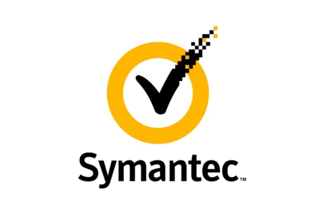
Price: $1,280,000,000
I understand that an expensive logo whose worth is more than $1 billion looks a bit exorbitant. However, Symantec Endpoint Protection is the company that bought the VeriSign tick-type logo (the one given in the above image).
They purchased it for $1.28 billion in 2010. Symantec integrated the VeriSign check mark into their logo. The purpose of this variation was to symbolize trust and authenticity.
2. NeXT
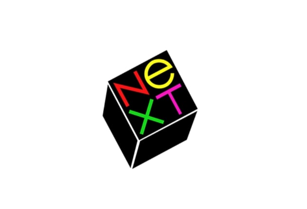
Price: $100,000
Paul Rand is a big name in the field of graphic design. He created the “NeXT” logo. The NeXT company is the hard work of Steve Jobs. He invested $100,000 in the making of this logo.
The core focus of Paul was to design a logo that clearly depicts brand identity. He created a comprehensive 100-page manual outlining the design process for NeXT. The manual detailed his stylization of the name of the company, changing it from “Next” to “NeXT”.
3. British Petroleum Logo & Marketing
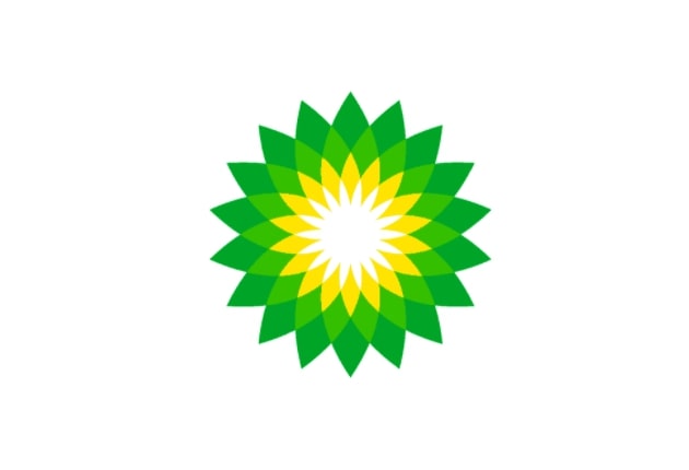
Price: $210,000,000
The BP (British Petroleum) logo is featuring a green and yellow flower-like design called the Helios. This is their recognizable symbol worldwide. It intends to convey the commitment of the company to environmental care and its efforts to address global warming.
Thus, their coping mechanism with one of the biggest worldwide challenges, global warming, is depicted in one of the expensive logos. More specifically, the word “Helios” is a name given to the Greek god of the sun.
However, the flower-like design of this expensive logo resembles a crown. It is also evoking themes of energy, nature, and radiance. Thus, this logo is fittingly representing a global energy company like BP.
4. Accenture Logo Design
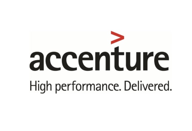
Price: $100,000,000
Accenture’s most expensive logo shows the company name in lowercase letters. It is accompanied by the tagline “High performance. Delivered.”
It also has a distinctive greater-than sign (> ) right above the letter “t” in the Accenture. In 2017, the logo went through a subtle redesign. It introduced the Rotis Sans Serif Extra Bold 75 font. Thus, the logo refined the overall look while maintaining the core elements.
5. Posten Norge (Rebrand)
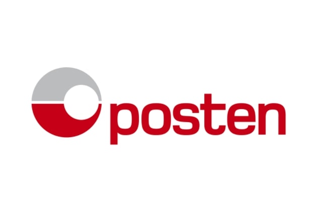
Price: $55,000,000
Posten Norge, Norway’s postal service, was founded in 1647. Since then, it has grown significantly as a leading mail and logistics company. It has one of the most expensive logos in the world, worth more than $55,000,000.
Posten Norge’s 2008 rebranding introduced its current logo. It is a grey and red sphere alongside the lowercase name “posten” in red. This modern branding reflects the evolution of Posten Norge as the best postal and logistics provider.
6. ANZ Banking Group Logo
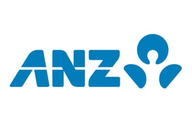
Price: $15,000,000
The Australian and New Zealand Banking Group (ANZ) formed its current logo after a merger between two banks. This expensive logo has the abbreviated name “ANZ” and a stylized (blooming) flower emblem in a classic blue color.
This blue color has been part of ANZ’s brand identity since the 1950s. It symbolizes stability and trust. According to ANZ, the beautiful logo features a lotus symbol which represents the regional connection of their company.
The symbol has two leaves and one flower. These three elements are acknowledged in Australia, New Zealand, and the Asia Pacific. Interestingly, M&C Saatchi beautifully designed this unique and costly logo.
7. BBC Logo (Redesign)
![]()
Price: $1,800,000
The BBC’s famous logo is iconic and recognizable globally. It features three white letters on a black background. The corporation introduced its first logo in 1958, with the current design being used since 1997.
The simple yet distinctive design has become synonymous with the BBC’s reputation. English speakers easily recognize this trusted and renowned broadcasting organization from its three letters logo – BBC. Credit goes to the simplicity and impressive nature of the logo.
8. CitiBank Logo
Price: $1,500,000
CitiBank, a subsidiary of Citigroup, has an extensive global presence with 2,649 branches in 19 countries. Hmmm…think about its worth! Their logo, designed for $1.5 million, is a significant aspect of their brand identity.
Paula Scher, a renowned designer from Pentagram, created the current CitiBank logo in 1998. The logo contains the word “citi” in blue which is then topped with a distinctive red arc. Interestingly, Scher’s impressive portfolio includes designing expensive logos for other notable brands like Microsoft, the Museum of Modern Art, and Bloomberg.
9. Pepsi Logo Redesign
![]()
Price: $1,000,000
Pepsi has been a longtime competitor to Coca-Cola since 1893. This beverage company has consistently used a red and blue color scheme in its branding. Now, Pepsi has grown into a global brand.
Specifically, it is recognizable by its iconic colors and logo. Its original all-red logo was revamped in 1950 with the addition of a blue color. This design change was also a YES to American patriotism.
The logos referenced the red, white, and blue colors of the US flag, particularly significant after World War II. The updated logo marked a new era for the brand. Moreover, the round shape of its logo indicates the bottle top. Thus, I can say that the story about Pepsi’s expensive logo is very interesting.
10. London 2012 Olympics Logo
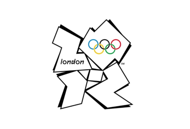
Price: $625,000
Here is another one of the most expensive logos in the world – the London 2012 Olympics Logo. This logo for the London 2012 Olympic Games got some criticism from the people due to its complex graphic design. But, these types of logos are easy to distinguish.
The 2012 London Olympics logo was designed by Wolff Olins in 2007. This graphic design company designed a stylized square with the year “2012” and the Olympic rings. The upper half of the design shows the word “London” in a bold, angular font.
11. City of Belfast
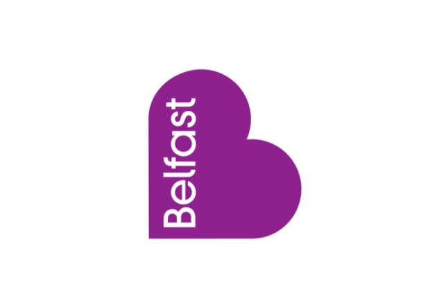
Price: $280,000
Did you know Belfast is the capital of Northern Ireland? It has its own most expensive logo. It’s a heart-shaped design that conveys inclusion, vibrancy, and a warm welcome message to Belfast.
This distinctive logo is a unique representation of Belfast’s identity and character. That’s why it is one of the most expensive logos in the world.
12. City of Melbourne Logo Design:
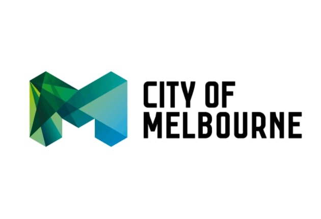
Price: $148,000
Let’s introduce another iconic and most expensive logo for a city – Melbourne. This logo is a clear representation of lively, corporate power, and the cool city of Melbourne.
Furthermore, the logo was designed by the Sydney office of Landor Associates in 2009. You can imagine its worthy logo. That’s why the city of Melbourne paid $148,000 for this expensive logo.
13. Sydney Opera House
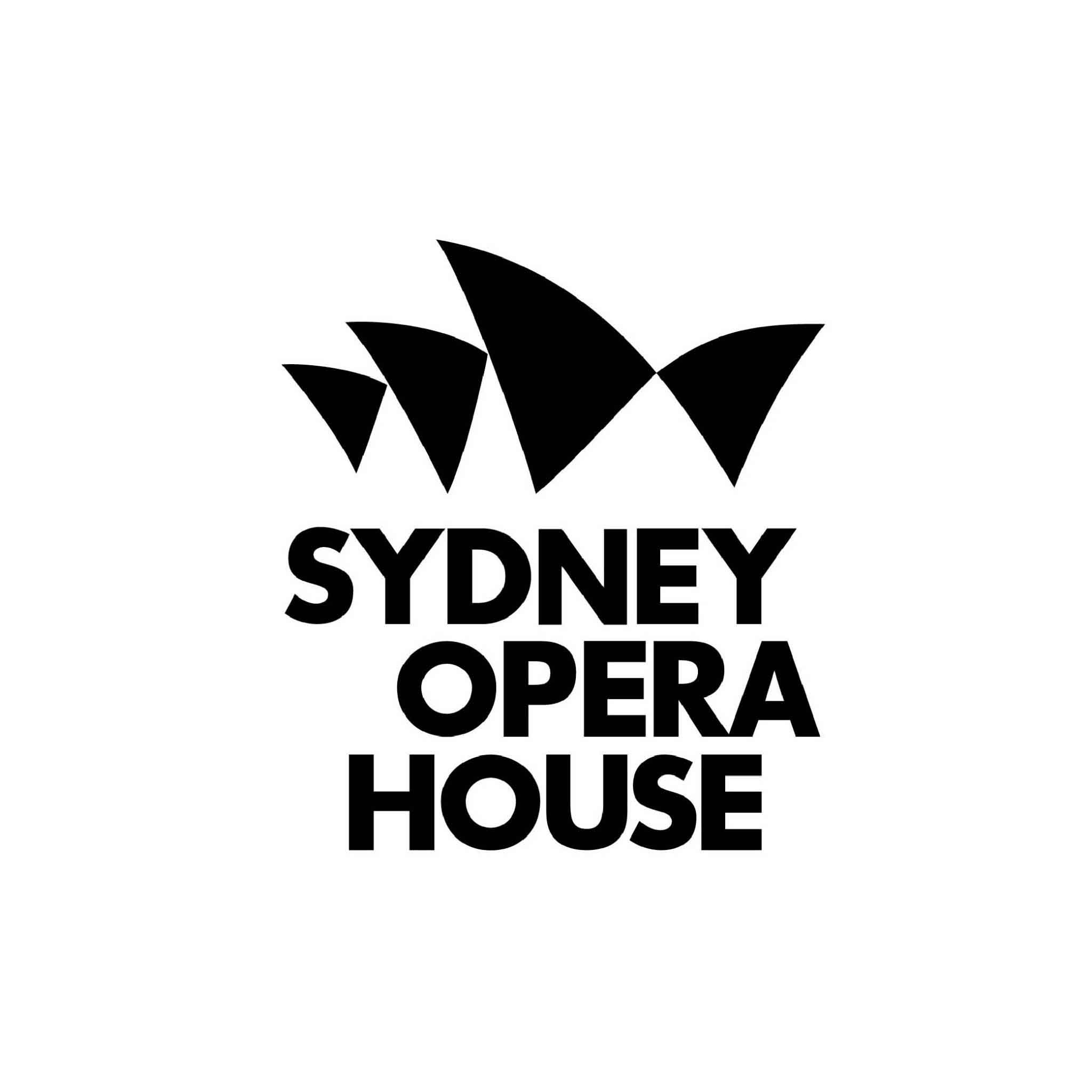
Price: $211,000
The Sydney Opera House is a renowned performing arts center with a distinctive sail-shaped roof. This House is a real example of luxury and sophistication. The building’s construction cost over $100 million in the 1970s. The logo, which is also iconic, came with a big price of $211,000. That’s why this logo earned a place in Guinness World Records.
14. Enron
Price: $33.9 million
Enron spent $33.9 million on Paul Rand to make its logo in 1990. Enron’s logo has a simple and stylish slanted “E” icon.
After some time, the logo became synonymous with corporate greed and excess. Unfortunately, the sleek design of the emblem masked the unethical practices of the company, which ultimately led to its downfall.
15. Hertz
Price: $1.5 million
Everyone knows that Hertz is a popular rental car company. They hired Lippincott to modernize their logo in 2013.
The rebranding introduced a new logo with a sloping “H” in yellow and black. The design replaced the previous wordmark enclosed in an oval.
Final Words on 15 Most Expensive Logos in the World in 2026
What do you think of these most expensive logos worth thousands and millions of dollars? I think it’s a long debate, but one thing is obvious. “Strong visual logos are very important for businesses and companies to be taken seriously.” The logos are the main reason for many businesses’ success. They represent the brand recognition and financial muscle of their respective companies.
Hence, I can say that the above-mentioned logos are truly legendary in the graphic design field with prices ranging from $280,000 to $1.28 billion. But, that doesn’t mean your logo should be expensive. Nike’s Swoosh logo was made for $35 and the worth of the company is in billions. So…your logos must not have to be expensive.