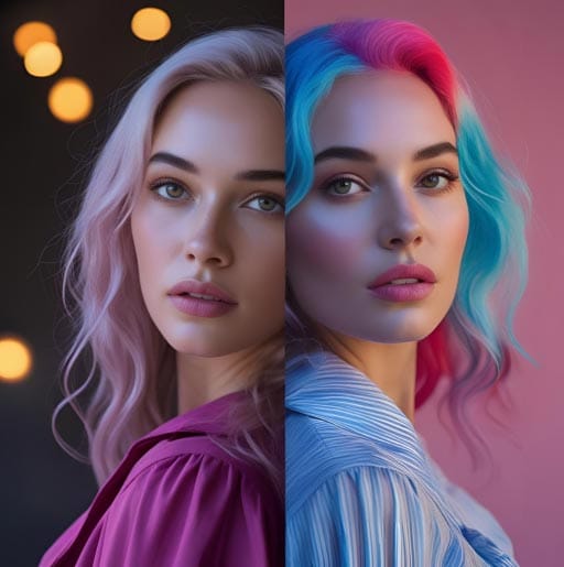
Color toning is like giving your photos a special juice. Raw pictures look boring and flat sometimes. They need color magic to make them pop. Common problems are colors that are too bright, too dark, or just blah. But you don’t need real crayons – you use computer magic. Some apps do auto color, but they are not good. Real color wizards use special tools to paint colors perfectly.
Color toning is a spice for photos. Warm colors like red/yellow make happy feelings. Cool colors like blue/green evoke calm feelings. You can mix them. Even simple photos become art with good color play. It’s not hard to start – just play with sliders and see what happens!
Why Color Toning Matters in Professional Retouching
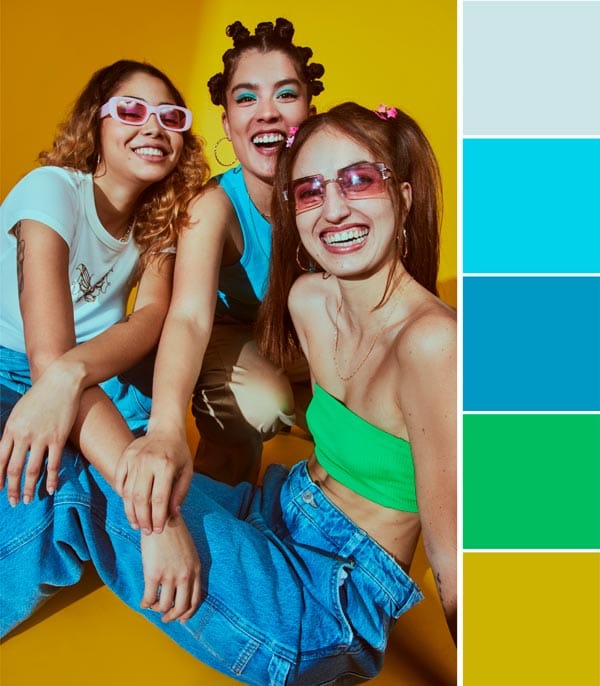
Countryside photos look best with warm gold colors. The yellow fields and brown barns need matching tones. You can also use sky blues or sunset oranges to make magic. Outfits like blue jeans look best with cool tones. Red dresses want warm tones. When you match colors well, the whole picture feels like a happy family. Wrong colors make photos feel sick. Like putting a winter coat on a summer beach picture – weird!
Good color toning hides mistakes, too. If the photo is too dark, adding warm light fixes it. If skin looks greenish, add pink tones to balance it. This is why pro photographers never skip this step. They know colors talk to people’s eyes. Bad colors shout “amateur!” Good colors whisper “pro quality”. Even expensive cameras need color help after. It’s like combing messy hair after a bath. Makes everything neat and pretty!
Color Theory Basics

Making colors work is like two hands clapping. Some colors are best friends (like blue and orange). Some colors of enemies (like red and green next to each other hurt eyes. You need to know the color of your friends to make the pictures nice. There are many color wheel pictures online. But just looking is not enough. Pro color fixers know secrets like warm colors come close, cold colors go back. Skin tones need special care – not too orange, not too gray. This smart color is not in phone apps.
Remember color moods! Red means excitement, like fire trucks. Blue means calm, like the ocean. Yellow means happy, like sunflowers. Green means fresh like grass. If doing baby photos, soft pinks are good. If doing sports pics, bright reds are better. Nature photos want earth brown greens. City night photos want neon blues and purples. Practice with food photos first – make oranges or anger, salads greener. Soon you feel like a color boss!
Types of Color Toning Techniques
You should try different color moods to show feelings. Happy pictures want bright yellows. Sad pictures like blue tones. Movie pictures often use teal and orange – that cool look. If your photo has shadows, you can make them blue. Sunlight spots can be golden. High angles might need different colors than low angles. You can try color tricks like split toning – shadows one color, lights another color. So many fun ways!
Global toning changes the whole photo the same. Local toning paints colors only where you want. Gradient maps make smooth color flows. Color lookup tables (LUTs) are like instant filters but better. Vintage photos use faded greens and browns. Modern photos use punchy blues and reds. Food photos need warm tones to make them yummy. Portrait photos need skin-safe pinks. Try all! Screenshot before/after shows the difference. Mix techniques like making cake – layers of flavors!
Choosing the Right Mood and Tone for Your Image
Since you are fixing photos, you should think about your mood first. This extra step makes photos tell stories. Usually, photos just have normal colors. But you might want warm memories or a cold future look. Don’t worry, it’s too hard! Start simple. Beach photos want warm gold. Forest photos want green tones. Night City wants blue and purple. Try little changes to see what feels good. I like trying on different hats!
Ask: What feeling do I want? A birthday party needs confetti colors – crazy brights. Rainy days need moody blues and greys. A romantic dinner needs candlelight, oranges. Old memories need faded browns. Future tech pics need electric blues. Nature shots need true greens. Make the color match your story. If confused, copy movie posters you like. They are expert mood makers. Save your favorite moods as presets for next time!
Working with Shadows, Midtones, and Highlights
Senior year photos need special color love. This important time is worth remembering with perfect colors. Although phones have filters, pro color toning is best for keeping photos forever. Moreover, the color tones show your personality. Happy people might want bright colors. Calm people like soft colors. Parents love to share these colorful images. Bad colors make photos look cheap. Good colors make photos priceless!
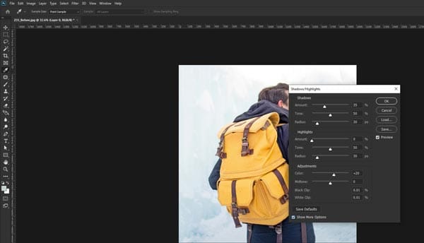
Shadows are dark areas – make them blue for cool mystery. Midtones are middle lights – keep skin natural here. Highlights are bright spots – make them golden for sunny feels. Use sliders to control each separately. Like having three light switches! Fix underexposed faces by brightening midtones. Fix blown-out skies by darkening highlights. Add purple shadows for fantasy looks. Practice on cloudy day photos – easiest to see differences. Soon you fix photos like a dentist fixing teeth – precise!
Using Curves and Levels for Precise Color Control
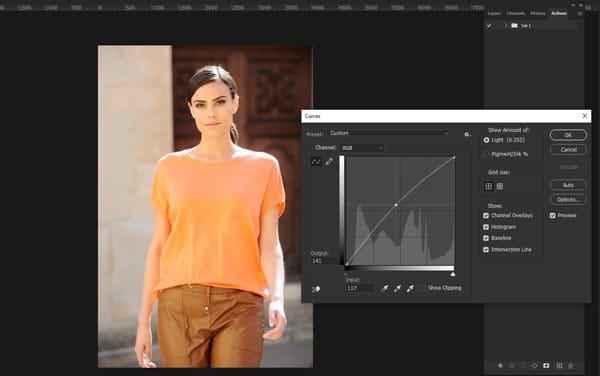
Photo wizards and beginners both should try color curves. No, questions like how curves work might confuse you. The color curves tool looks scary but fun. It helps you control colors in a super exact way. Like being a color boss! When you learn this, you feel more powerful with photos. Besides, the work you do to learn curves makes you a better photo fixer. Most importantly, your photos will look movie quality and make people wow. The Curves tool lets you change shadows, middles, and brights separately. Like having three light switches for one photo! You can make skies bluer without changing skin. Magic!
Start with an RGB curve – drag up to brighten, down to darken. Make an S-shape for contrast pop. Then try color curves – red/green/blue channels. Pull the red curve up and add warmth. Pull blue down to remove cold feelings. Use point curves to fix specific areas. Watch tutorials with crayon drawings – helps understand. Save your best curve settings as “magic fixes”. Soon you will do complex color dances even pros admire!
Color Grading vs. Color Toning: What’s the Difference?
Color grading and color toning sound the same, but they are different things. Color gradient is like the big boss; it controls the whole look of the movie or photo. Ifixesix colors that are wrong and make sure everything matches well. Color toning is a smaller job; it just adds a special color feeling on top, like making it warm gold or a cool blue mood.
You do grading first to get colors right, then toning to make it feel special. Think of it like building a house. Toning is putting up the pretty curtains and lamps that make it feel cozy or exciting. Both are important for making pictures look pro, but they do different things. Don’t mix them up, okay? Toning is the final touch that gives the photo its special style feeling after grading and fixing the basics. You need both for the best pictures.
Popular Color Toning Styles
Lots of cool styles you can try to make your photos look amazing. Cinematic style is very popular; it makes photos look like they are from a big movie. It uses dark shadows and bright highlights, and colors like teal and orange are common. It makes things look dramatic. Vintage style makes photos looold-timeyey, like from a grandpa’s camera. It adds faded colors, maybe a bit brown or yellow, and makes whites not so white. Like an old photo found in a box.
Warm toning makes everything feel cozy and happy, like sunshine or fire. It added yellow, orange, and red colors a little bit. Good for pictures of people smiling or sunsets. Cool toning makes you feel calm or maybe sad, like a winter day. It adds blue or green colors. Good for water pictures or serious portraits. Pick the style that matches what your photo is about. EEStyle tells a different story with colors.
Tools and Software for Effective Color Toning
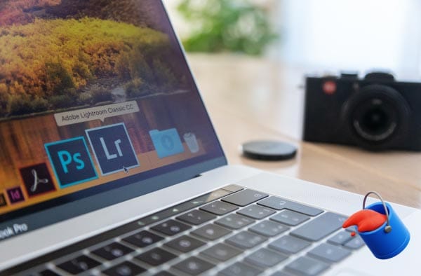
You need good tools for doing color toning right. Adobe Photoshop and Lightroom are the big names; many pros use them. They have lots of buttons for changing colors exactly how you want. But they cost money, maybe too much for some people. Don’t worry! There are cheaper or free options too. Like GIMP, it is free and can do many toning things. Or Capture One, good for photos from fancy cameras.
On your phone, apps like VSCO or Snapseed are easy to use. They have filters that do toning fast with one tap. Good for quick fixes, but maybe not so precise. For best control of the computer, use the Curves tool or Color Balance in Photoshop. This lets you change shadows, midtones, and highlights separately. Play with the sliders, see what happens. Start simple, don’t use too many tools at once. Practice makes you better.
Common Mistakes to Avoid in Color Toning
Many people make mistakes when they do color toning. A big mistake is doing too much. Like, making the orange so strong everyone looks like a pumpkin! Or the blue so much that it feels cold. Keep it subtle; a little bit of change is often best. Another mistake is forgetting the skin. If you add a tone, check the person’s
It should still look like real skin color, not green or purple, unless it’s a zombie photo. Also, not matching the tone to the picture story. Like putting a super happy warm tone on a sad rainy day photo, ilooksok weiRoadd. The colors should help tell the story, not fight it. And ignoring the white balance first. If your photo color is wrong to start with, adding a tone makes it worse. Fix the white balance well before you add your special color style.
FAQs
What is color toning?
It adjusts the color balance to change a photo’s mood.
How to apply color toning?
Modify hues, saturation, and brightness in editing tools.
Best tones for portraits?
Warm tones for softness, cool tones for a moody look.
How to avoid over-toning?
Keep adjustments subtle and natural.
Final Thoughts
Color toning is a superpower for making your photos look pro and feel special. It is not hard to learn the basics. Remember the difference from grading: grading fixes, toning styles.
Take your photo retouching to the next level with expert color toning that captivates. Let Zenith Clipping bring balance, depth, and emotion to every image.